So it’s no wonder that people are both subconsciously and deliberately using the psychological impact of colour to bring calm, contentment and joy at the moment. In the world of fashion this has been dubbed ‘dopamine dressing‘ but it doesn’t need to be reserved for outfits. You can apply the same logic of dopamine dressing to your home.
Bernay Laity, a colour consultant and applied colour psychologist with Philip Martyn, tells R29 that she has noticed certain colours which she associates with uplifting and soothing our moods becoming increasingly popular in interiors recently. Various outlets have promoted brighter, bolder palettes but people are actually seeking “softer, muted colours. In particular: violet, a pale grey green and a pale light grey blue, and also a warm orange pink.”
At first glance, dopamine dressing seems to suggest going for bolder colours as many of us associate bright colours with happiness. Laity suggests however that setting softer, more soothing colours in contrast to brighter accents is a way to lift your mood without overwhelming the space.
So if you are seeking to breathe new life into a space, reinvigorate your home or just bring a touch of calm and happiness to your surroundings, we’ve pulled together the shades that Laity and Valspar, together with colour psychology expert Justine Fox, have selected as a baseline to elevate your mood. Whether you’re going for a complete room overhaul or a couple of accessories, these shades all work beautifully in concert to gently enliven a space, and provide a perfect backdrop to bolder, brighter shades.
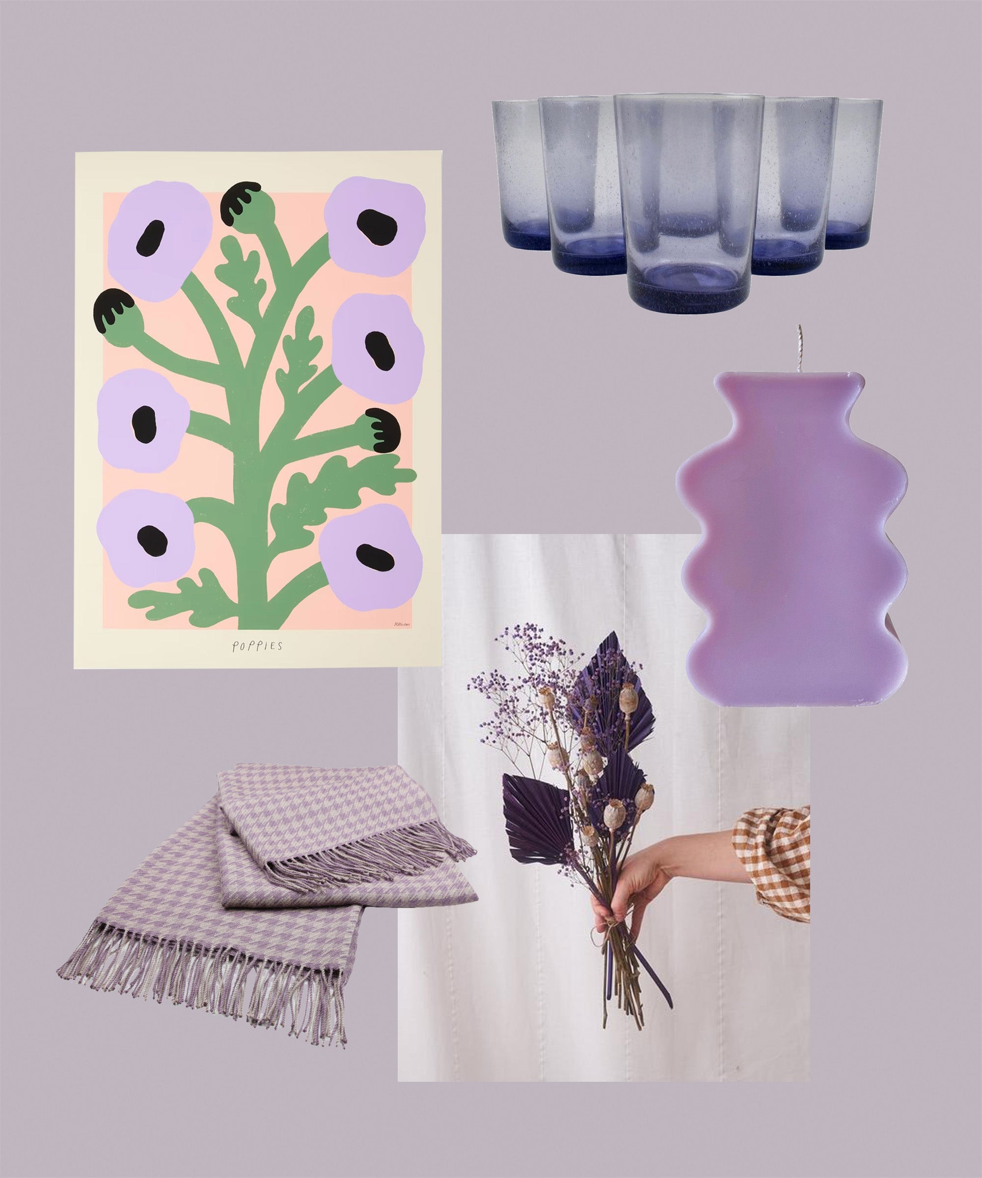
Violet shades, particularly at the lighter end of the spectrum (think lilac and lavender), are emerging everywhere. It’s a playful and joyful colour to embrace without being too overwhelming. “Violet is helpful for introspection,” adds Laity.
Dulux Dulux Paint Mixing Easycare Washable & Tough Matt, $, available at Dulux
British Colour Standard Boxed Set of 6 Recycled Glass Tumblers – Violet, $, available at Trouva
Botanique Workshop Mixed Dried Bunch Palm Spear And Gyp In Purple With Natural Poppy Heads, $, available at Trouva
The Poster Club Purple Poppies, $, available at Made
MAZA Bebe Candle Purple, $, available at Glassette
The Alpaca Co The Alpaca Co. Houndstooth Throw, $, available at Not On The High Street
Dibor Set Of Four Purple Embossed Wine Glasses, $, available at Not On The High Street
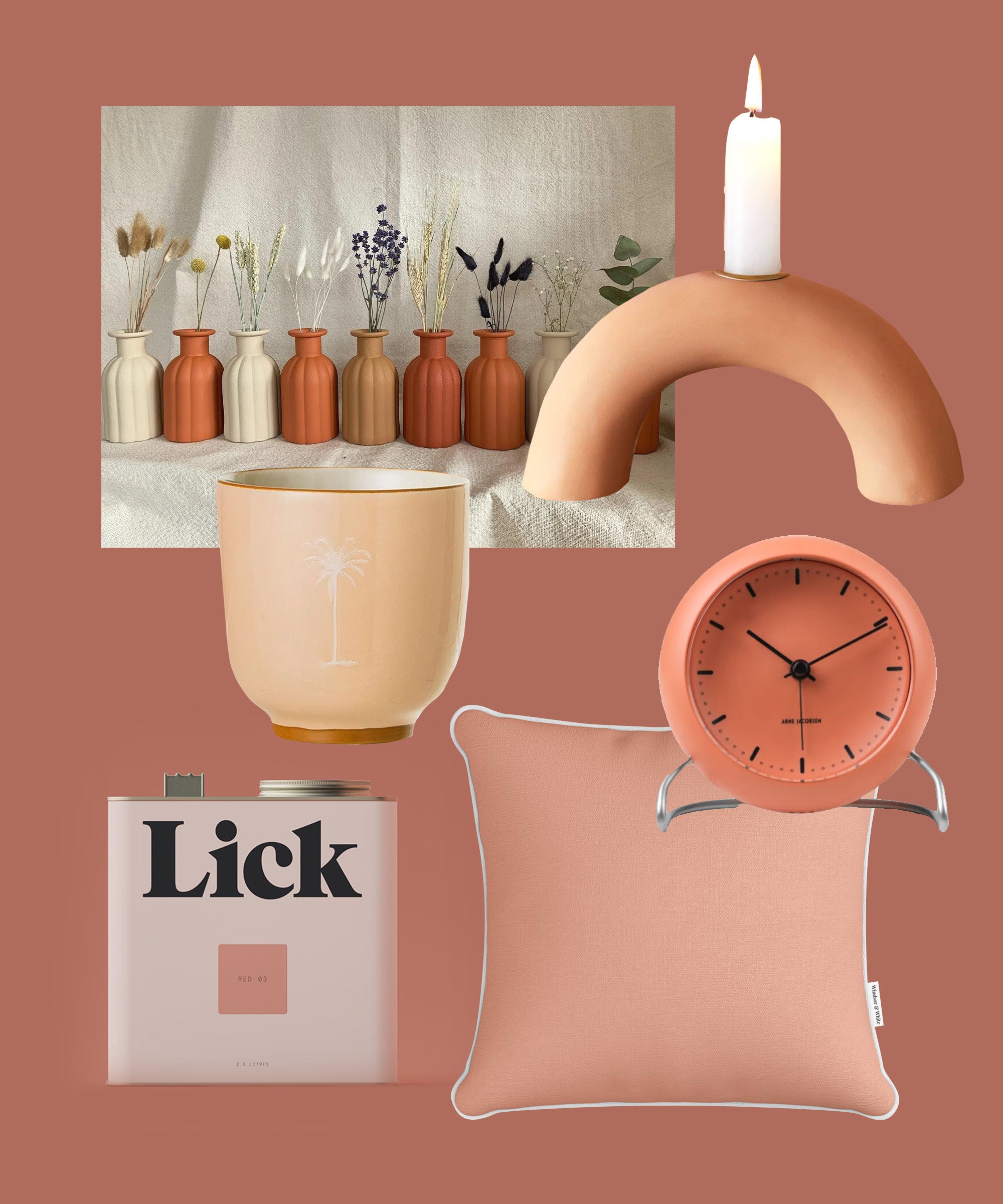
The warmth of orange pink shades (from blushing peach to warm terracotta) is a bit of a contrast to the cooler, grey toned colours in this list and thus brings some much-needed warmth. As Laity puts it: “This colour gives this feeling of comfort and safety and having enough.”
Lick Red 03 Matt, $, available at Lick
Rosendahl Arne Jacobsen City Hall Table Clock Pale Orange, $, available at Trouva
BrushedEarthHome Matte Textured Medium Daisy Vase for Dried Flowers | 9 Colours Available | Boho | Faux Terracotta | Hand Painted Glass, $, available at Etsy
MBT Studio Plain Apricot Orange Cushion, $, available at Not On The High Street
Lisa Angel Terracotta Arch Candlestick Holder, $, available at Not On The High Street
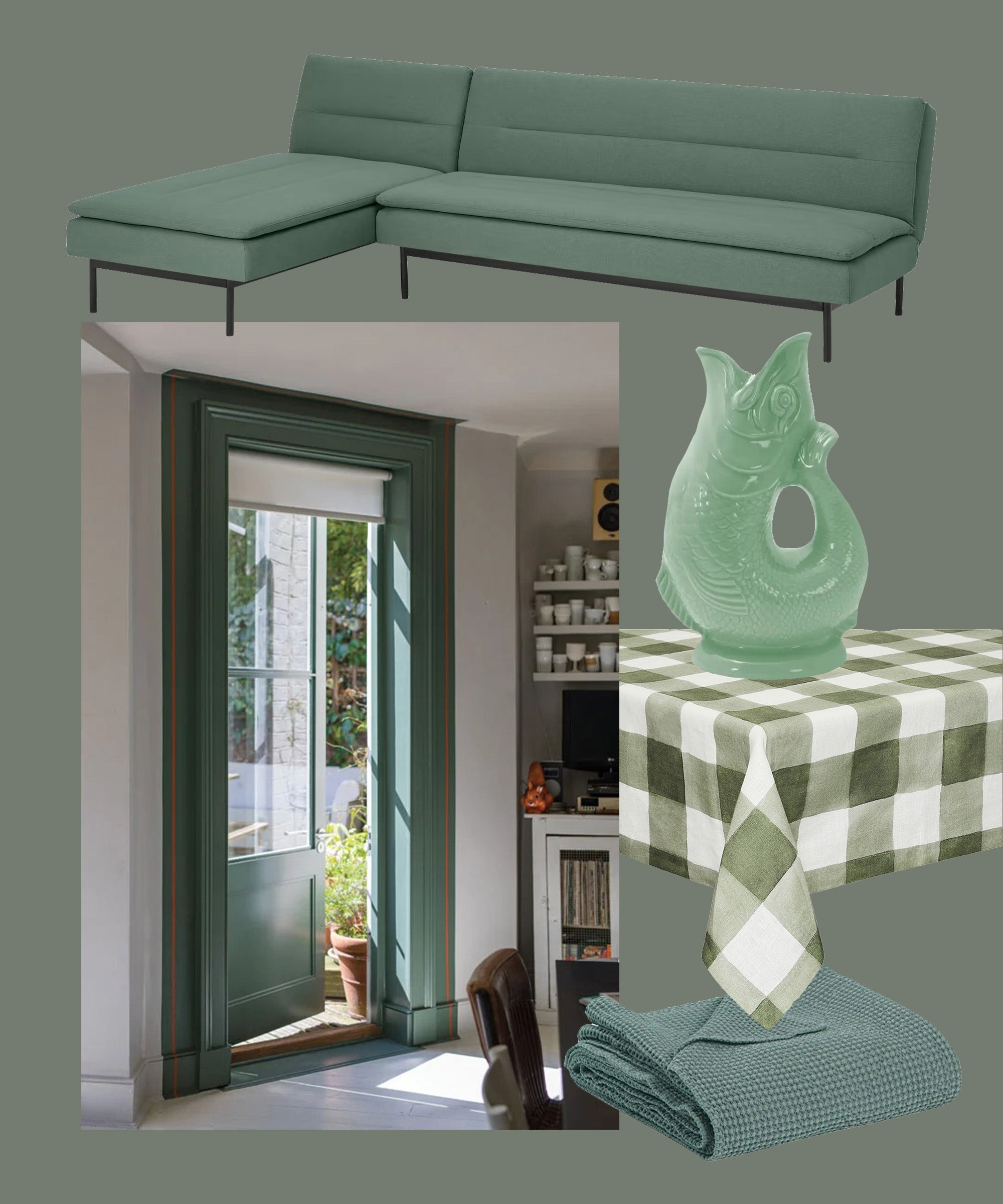
Green is the colour of nature and carries with it a sense of new beginning. In its more grey tone, Laity says: “Green is more peaceful, more relaxing and restorative.”
Maia Maia Stonewashed Throw Green-Grey, $, available at Trouva
Farrow & Ball Green Smoke, $, available at Farrow & Ball
Wade Ceramics Sage Green Gluggle Jug, $, available at Trouva
Made Chaise End Click Clack Sofa Bed, Alpine Green Fabric, $, available at Made
The Sette Gingham Tablecloth, $, available at Glassette
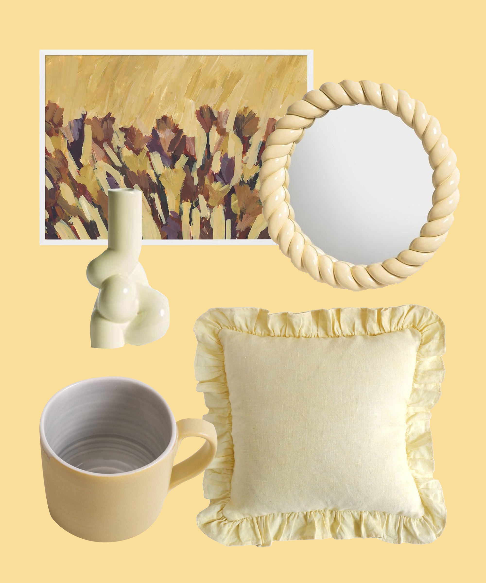
Like the warmth of orange pink, there’s a sunniness and lightness to yellow. By choosing a softer tone you can evoke the happiness of the brighter shade without overwhelming, and complement the other shades beautifully.
Valspar Valspar Simplicity Wall & ceiling Matt Emulsion, 2.5L Soft Focus R129A, $, available at B&Q
Hay W S Candle Holder Soft Yellow, $, available at Trouva
&klevering Yellow Round Braid Mirror, $, available at Trouva
Made Autumn In The Canyon, $, available at Made
ELDORADO THE STUDIO Ruffle Cushion, $, available at Glassette
Linda Bloomfield Handmade Short Mug, $, available at Not On The High Street
Footstools And More Camden Piped Drum Stool, $, available at Not On The High Street
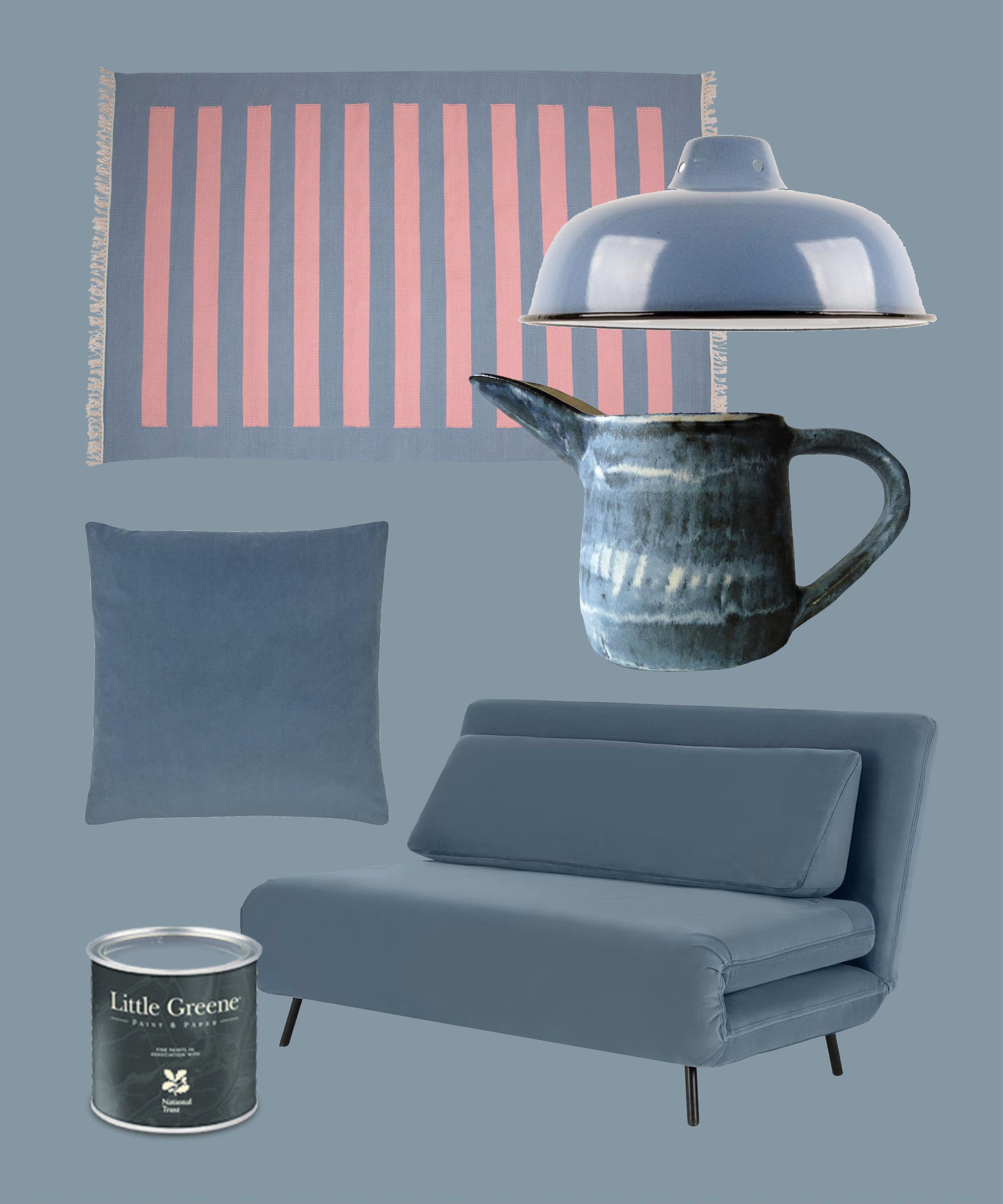
Hazy, light blues “calm the mind”, says Laity. Unlike greener or more yellow blues, grey-toned blues have a very deliberately soothing effect, making a room a more comforting place to be in.
Creatively Occupied Talvi Small Jug, $, available at Not On The High Street
The Little Greene Paint Company The Little Greene Paint Company Intelligent Matt Emulsion, Mid Blues, James (108), 2.5L, $, available at John Lewis
Victoria & Co Wedgewood Blue Velvet Cushion 50×50, $, available at Trouva
Smithery Large Enamel Lampshade, $, available at Trouva
Made Large Sofa Bed, Arctic Blue Velvet, $, available at Made
The Campbell Collection Blue Riaz Rug, $, available at Glassette
Like what you see? How about some more R29 goodness, right here?
I Use Dopamine Dressing To Feel Positive