In late 2022, Pantone’s colour forecasters predicted that we’d spend the following year cruising through “The Magentaverse,” a digital realm where ultra-bright pinky purples morphed into shocking scarlets with the trippy day-glow ease of a lava lamp. According to the company, Viva Magenta, the 2023 Colour of the Year (COTY), was “audacious” and “rebellious,” a hue designed to express forward momentum rather than nostalgic yearning. Twelve months later, and we’re singing a new, retro tune. Welcome to the stage 2024 Pantone Colour of the Year: Peach Fuzz. I have no doubt I’ll be getting my fill of you soon.
Depending on your preference, Peach Fuzz is either a nice shade of mellow orange or a, well, peachy, almost-neutral pink. I’m choosing to think of it as the former; it doesn’t feel like a true pink to me — there’s a distinct yellow undertone that sets it apart from the exhausted Millennial Pink trend of 2016 — but it certainly has that old-school femme appeal. It’s a colour suited to pressed glassware, fuzzy balletcore wrap cardigans, and slinky slip dresses. It’s a good colour for spring, though few would call it groundbreaking.
According to Leatrice Eiseman, executive director at the Pantone Colour Institute, Peach Fuzz was chosen to reflect our current “need for nurturing, empathy, and compassion.” It’s an optimistic colour (Pantone’s other descriptors include “soft futurism” and “sanctuary”). Eiseman points out that the last few years have been filled with economic turmoil and global strife, causing many to reflect on their current lifestyles and make major changes. “The past has happened, there’s no going back,” she says. “Now we’re thinking, how do we want to live our lives?” Peach Fuzz is intended to be inspiring and nurturing, a colour that can “give permission.”
Leaving aside its dubious powers of absolution, I think the nicest thing about Peach Fuzz is its availability. Granted, Pantone’s many brand collaborations ensure that the COTY will make it onto big box store shelves — I particularly like the KitchenAid mixer, which looks almost rose gold to my eyes — but this faded apricot can be found in plenty of vintage stores, too.
Fashion has always had time for pinks, and peach has been an important part of several standout colourways of the past centuries. Immediately upon seeing the 2024 hue, I was reminded of historic hues like Madame Pompadour’s favoured blush tones (at the time, the royal mistress’ powdered and rouged visage apparently sparked a nationwide trend of pink everything) and the light rosy hues of Rococo Europe (Jean-Honoré Fragonard’s 18th-century painting “The Swing” is a symphony of verdant greens and frothy peach). Both of these examples emphasise the colour’s risqué side rather than the sweet innocence we tend to associate with it today—or perhaps that’s the tension of Peach Fuzz. Like the fruit it was named for, this colour can read as pastel, baby-soft, guileless… Or it can be a little tainted by a sense of impropriety, a little bit smutty but in a safe way, flirty, maybe. A nod to one of the most erogenous parts of the human body.

The 20th century also saw plenty of peach. Starting in the early 1900s and straight through the ’40s, the hue enjoyed the same type of popularity as other intermediate colours, including eau de Nil, champagne, and mauve that fell outside the purview of the typical colour wheel (red, blue, green, et cetera). By the 20th century, most people were well versed in the ways of the rainbow and the colour classification systems — a field of study that had emerged some 100-plus years earlier — and so “off-brand” shades had finally found an audience. With the arrival of technicolor television and the proliferation of synthetic dyes, people were able to see, identify, and purchase clothing in every shade of the rainbow (and beyond).
While there were still plenty of starlets who preferred classic red, the 1930s marked a decade of peak peach in Hollywood. Silky, draped, flowing peach dresses were a common feature on red carpets. Like the bias cut, which was also popularised during this period, the colour had an effect of making women with certain complexions appear, well, not exactly nude, but close to it. Before the scandalous adoption of sheer, bejewelled “naked dresses” (a la Marilyn Monroe and Kim Kardashian), there was the Carrie Bradshaw-style slip. No one called it boudoircore at the time, but that was the vibe.
After several decades of bright primary colours and psychedelic secondary hues, peach reemerged in the fashion world in the ’80s as part of the general Art Deco revival. Mauve, rose, blush, and peach all paired well with the big gold jewellery of the era, and by offsetting these dirty pinks with bold jewel tones (cobalt and iris), designers were able to make the vintage hues feel fresh again. The ’80s also saw a rise in peach décor, particularly in the private spaces of the bedroom and bathroom. Peach toilets, tubs, and sinks were considered quite fashionable — an update of the Mamie Pink washrooms of the ’50s — as was faded terracotta paint.

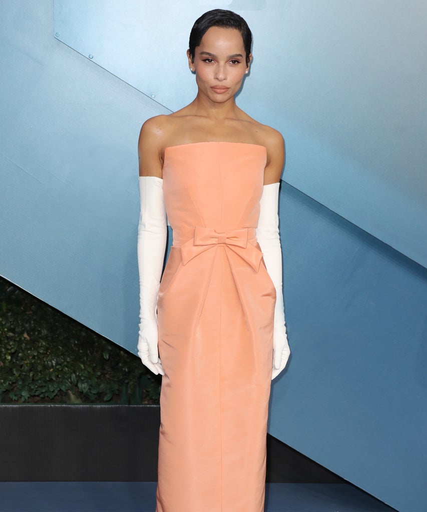
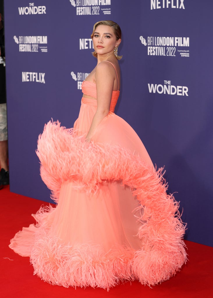
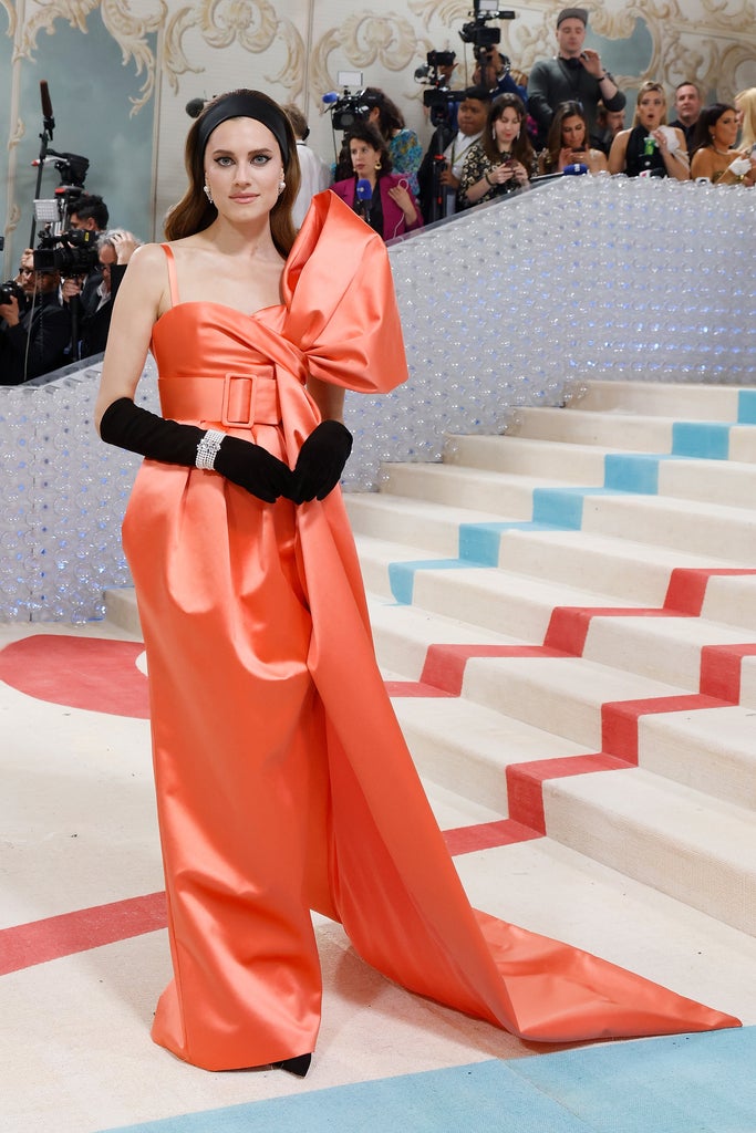
Although recent years have been pink-heavy, thanks to the influence of The Wing, Glossier, and all those 2010s girlboss brands, peach has its own niche appeal. On the red carpet front, Florence Pugh has an affinity for the colour; she’s worn several great peach outfits in the past few years (including multiple looks by Valentino and one fabulous tulle number by Rodarte). Zoe Kravitz has stunned in peach (top photo), as has Allison Williams. The colour also plays a huge role in the balletcore aesthetic, a dancer-off-duty style of dressing that has been bouncing around TikTok and Instagram for the past few seasons. In fact, Peach Fuzz is precisely the shade of my daughter’s little ballerina slippers (I distinctly remember buying a peach-coloured dance bra back in my junior high years as well). Again, the amount of peach in fashion is what makes this COTY feel particularly accessible. If you don’t already have a peach item in your closet, it won’t be hard to add. Just visit a vintage shop or your local dancewear shop.
The 2015 COTY Marsala aside, Pantone rarely veers towards earth tones, perhaps because they’re less readily recognisable as distinct shades, and that’s a shame. Browns are complicated and interesting, and don’t get enough respect. While Peach Fuzz isn’t as striking as amber or as multifaceted as sienna, it feels akin to these complicated, ancient colours. And, personally, I think there’s something so beguiling about the weird ones, the mixed-up colours, the faded adobe reds, and the dried grass golds. They’ve got a faded depth that beats out Viva Magenta’s attention-grabbing brightness. For me, Peach Fuzz is a step in the right direction: It will require little investment and maybe, just maybe, this COTY will inspire a few homeowners to put off that bathroom remodel for just a little longer.
Like what you see? How about some more R29 goodness, right here?